
Imagine you’ve just hired a new team member to manage your social media. They’re talented, enthusiastic, and ready to get started. Then they ask: “Can you send me the brand guidelines?”
If your answer is “we don’t really have those, just look at what we’ve posted before and match the vibe,” you’ve just handed them a problem you’ll spend the next three months cleaning up.
Brand guidelines aren’t a luxury for large corporations. They’re the document that protects everything you’ve invested in building your logo, your colours, your voice, your visual identity. Without them, your brand is only as consistent as the memory of whoever last worked on it.
What Brand Guidelines Actually Are
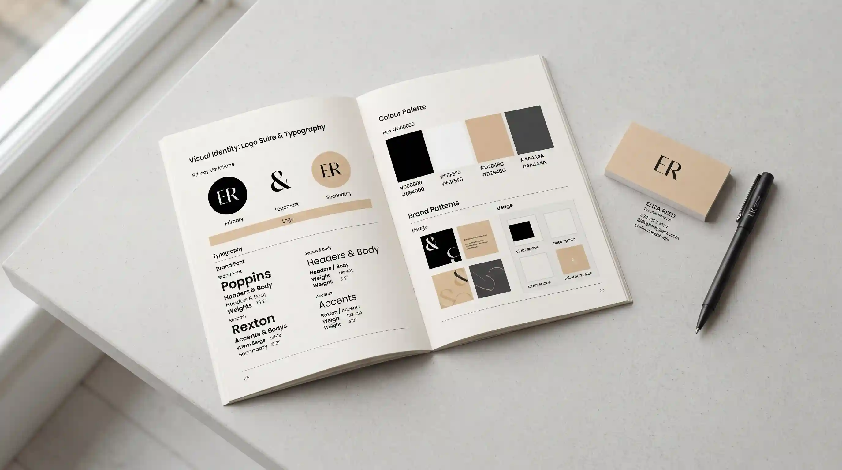
A brand guidelines document, sometimes called a brand style guide or brand bible, is a reference that defines exactly how your brand looks, sounds, and behaves across every platform and material.
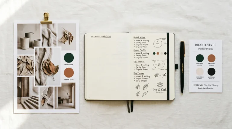
It’s not a creative brief. It’s not a mood board. It’s a set of documented decisions that removes ambiguity from every future design or communication task. When your printer asks what shade of green to use on your packaging, the answer is in the guidelines. When a freelance designer creates social media assets for you, the guidelines tell them precisely what’s on brand and what isn’t.
The best way to think about it: brand guidelines are the difference between a brand that grows stronger every year and one that quietly fragments as more people touch it.
What Goes Into a Brand Guidelines Document
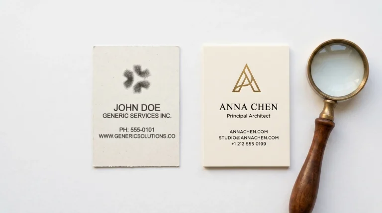
Logo usage is usually the first section. This covers all approved versions of your logo, the primary version, secondary versions, the icon-only mark and specifies exactly when to use each one. It also defines what you should never do with the logo: stretch it, recolour it, place it on a clashing background, crowd it with other elements. These rules might seem obvious until the day a well-meaning team member breaks them.
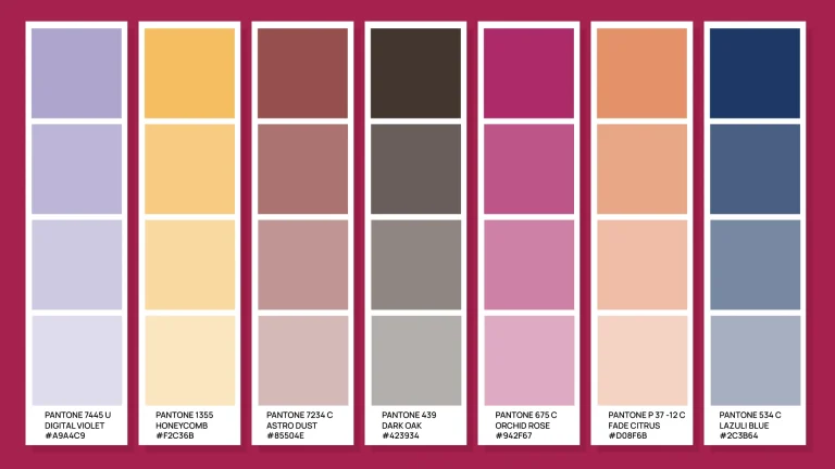
Colour specifications go beyond listing your brand colours. A complete colour section gives the exact HEX codes for digital use, RGB values for screen, and CMYK values for print. It also defines which colours appear together, which combinations are off-limits, and how colours should be applied in different contexts, such as a website, a printed brochure, or an outdoor banner.
Typography covers your brand fonts: the primary typeface for headlines, the secondary for body text, and fallback options for digital spaces where brand fonts may not render. It specifies sizes, weights, line spacing, and the hierarchy that keeps your communications looking intentional rather than assembled by different people with different preferences.
Brand voice is where many Kenyan businesses leave a significant gap. Your visual identity can be perfectly consistent while your captions sound like five different people wrote them because five different people did. A voice section defines personality behind your words: how formal or conversational your brand sounds, what language it uses and avoids, and how it adjusts tone in different contexts like a LinkedIn post versus a customer complaint response.
Imagery and photography style define the kind of visuals that belong in your brand world. What subjects, what lighting, what mood, what environments? A brand that consistently uses warm, natural photography feels very different from one that mixes studio shots with stock imagery and phone photos, even if the logo and colours are identical across all of them.
The Real Cost of Not Having One
Without brand guidelines, every new touchpoint is a small gamble. A printer interprets your logo colour slightly differently. A social media manager uses a font that looks similar but isn’t quite right. A new team member writes captions that sound passionate but are completely off-brand. Each change is minor. Accumulated over months, they add up to a brand that feels scattered even to people who can’t explain why.
Recognition is built on repetition. The same colours, the same fonts, the same tone of voice, the same visual style seen enough times across enough places is what makes a brand feel established and trustworthy. Inconsistency interrupts that process. It forces your audience to relearn who you are every time they encounter you, instead of instantly recognising and trusting what they already know.
Consistency isn’t about being rigid or boring. It’s about being recognisable. The world’s most distinctive brands, the ones with instant recognition, are built on strict consistency applied with creativity. The guidelines create the rules. The creativity happens within them.
When You Actually Need Brand Guidelines
The honest answer is: earlier than most businesses think.
You need brand guidelines the moment anyone other than you starts creating content or materials for your business. A social media manager. A freelance designer. A printer. A marketing agency. The second another person touches your brand, you need documented standards because “make it look like us” is not a brief.
You also need them when you’re preparing to scale. If you’re planning to expand your team, open a new location, launch a new product line, or start working with external partners, brand guidelines keep everything in line without you personally reviewing every output.
And you need them if you’ve recently rebranded. A new logo and a new colour palette without accompanying guidelines is an unfinished job. The guidelines are what turn a design deliverable into a brand system.
How Detailed Should Your Guidelines Be?
This depends on the size and complexity of your business, but simpler is almost always better to start with.
A small business doesn’t need a 60-page document modelled on a global corporation’s brand bible. A tight, well-organised 10- to 15-page guide covering your logo, colours, typography, voice, and imagery style is enough to keep most teams aligned and most external partners on-brand.
The goal isn’t comprehensiveness for its own sake. The goal is a document people will actually use, one that’s easy to navigate, easy to understand, and easy to hand to someone who has never encountered your brand before.
Final Thoughts
Over the past few months in this blog series, we’ve talked about why your logo isn’t your brand, how to choose the right colours, and what a complete brand identity looks like. Brand guidelines are where all of that becomes actionable: the document that takes every decision you’ve made about your brand and makes it repeatable, scalable, and protected.
Without guidelines, even the best-designed brand gradually unravels as more hands touch it. With them, every new team member, every external designer, every printer and partner becomes an extension of your brand rather than a risk to it.
At Break Concepts, brand guidelines are part of every branding project we deliver. If your business is running without them, let’s talk; it’s one of the most valuable things we can put in place for you.