
Walk into any supermarket in Nairobi and pick up two competing products, say, a premium cooking oil and a budget one. Before you read the price or check the label, you already have a feeling about which one costs more. The colours told you.
That’s not accidental. The brands behind those products made deliberate choices about what their packaging communicates and colour was doing most of the heavy lifting.
Most small businesses don’t approach colour that way. They pick what looks nice, or what they personally like, or they ask their designer to “make it pop.” None of that is a strategy. And none of it will build a brand that people recognise and trust.
Colour Communicates Before Words Do
The reason colour matters so much in branding is timing. A person sees your colour before they read your name, your tagline, or your product description. That first visual impression creates an emotional response and that response either aligns with what you’re selling or works against you.
A wellness brand using aggressive red and sharp black is fighting itself. A luxury service business using clip-art colours is undercutting its own pricing before the conversation starts. The mismatch between visual language and brand promise is something clients feel even when they can’t articulate it.
What Colours Actually Say
Colour psychology isn’t mystical; it’s pattern recognition built up over years of cultural and commercial exposure. Here’s what most audiences bring to common colours:
Blue builds trust. It’s why banks, law firms, and insurance companies lean on it heavily. If your business asks clients to put faith in you with their money, their health, or their reputation, blue earns that faith faster than most colours.
Green signals nature, growth, and health. In many African markets, it is also associated with prosperity. It’s a natural fit for organic products, wellness brands, and anything rooted in sustainability, like Tanga Organics, whose green identity immediately conveys the brand’s ethos.
Black is authority and sophistication. Used well, it says premium without effort. Used badly, it says cold and inaccessible. The difference is usually in the supporting colours and typography alongside it.
Gold and warm yellow carry optimism and aspiration. In the Kenyan market particularly, gold communicates quality and prestige in a way that feels culturally resonant rather than foreign.
Red demands attention. It’s urgent and energetic, which makes it effective for promotions, food brands, and retail. But a business built on calm, trust, or long-term relationships will struggle against what red keeps saying.
White creates space and clarity. Most brands underestimate it, treating it as the absence of a colour choice rather than a choice in itself. Used intentionally, white communicates clean, modern, and focused.
Building a Palette That Actually Works
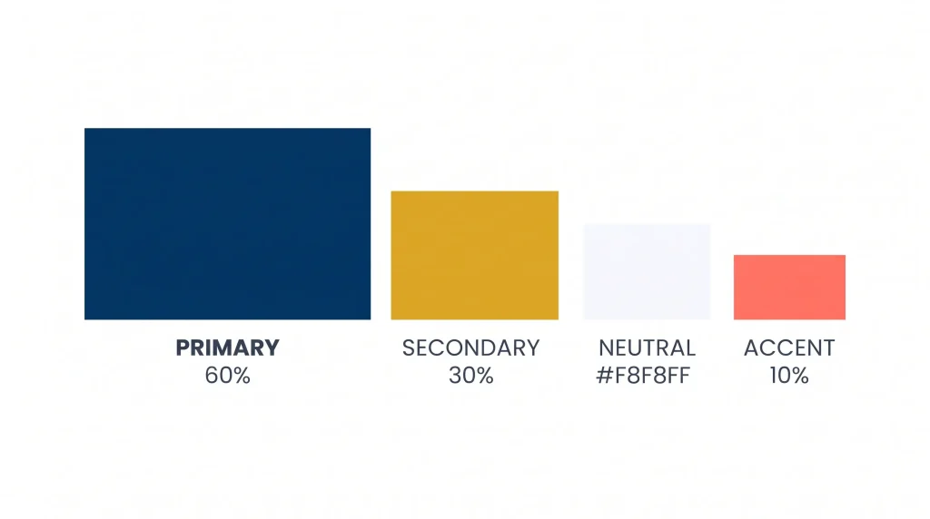
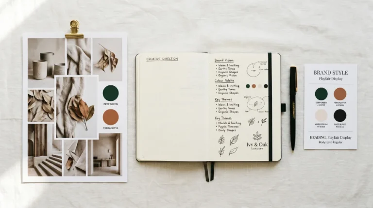
A brand colour palette isn’t a mood board. It’s a working system, and it needs structure to function.
Start with one primary colour. This is your anchor. It should appear most consistently across everything your brand touches, and it should directly reflect your brand’s core personality. Everything else supports it.
Add one secondary colour that complements, not competes with, your primary. This gives your brand visual range without creating noise. Think of it as the supporting actor. Present, useful, but not fighting for the lead.
Then add a neutral white, black, cream, or warm grey. Neutrals are where most of your design lives. They give your primary and secondary colours room to land with impact rather than getting lost in visual clutter.
If you need a fourth colour, make it an accent. Used sparingly on a call-to-action button, a key statistic, a design highlight, or an accent colour guides attention exactly where you want it.
A practical ratio to keep in mind: 60% primary, 30% secondary, 10% accent. Apply this across any design: a webpage, a social post, a printed flyer and the result will feel balanced rather than chaotic.
The Mistakes That Cost Businesses Most
Choosing colours you personally love is the most common one. Your brand is not for you; it’s for your audience. A founder who loves burnt orange, running a conservative financial advisory business, is creating a visual mismatch that erodes trust before a meeting is booked.
Using too many colours is the second. Every colour you add dilutes the ones already there. Three to four colours, used with discipline, will always outperform six colours used loosely.
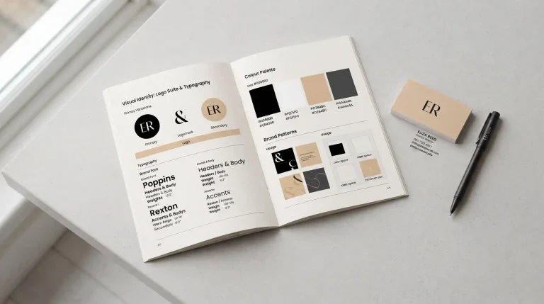
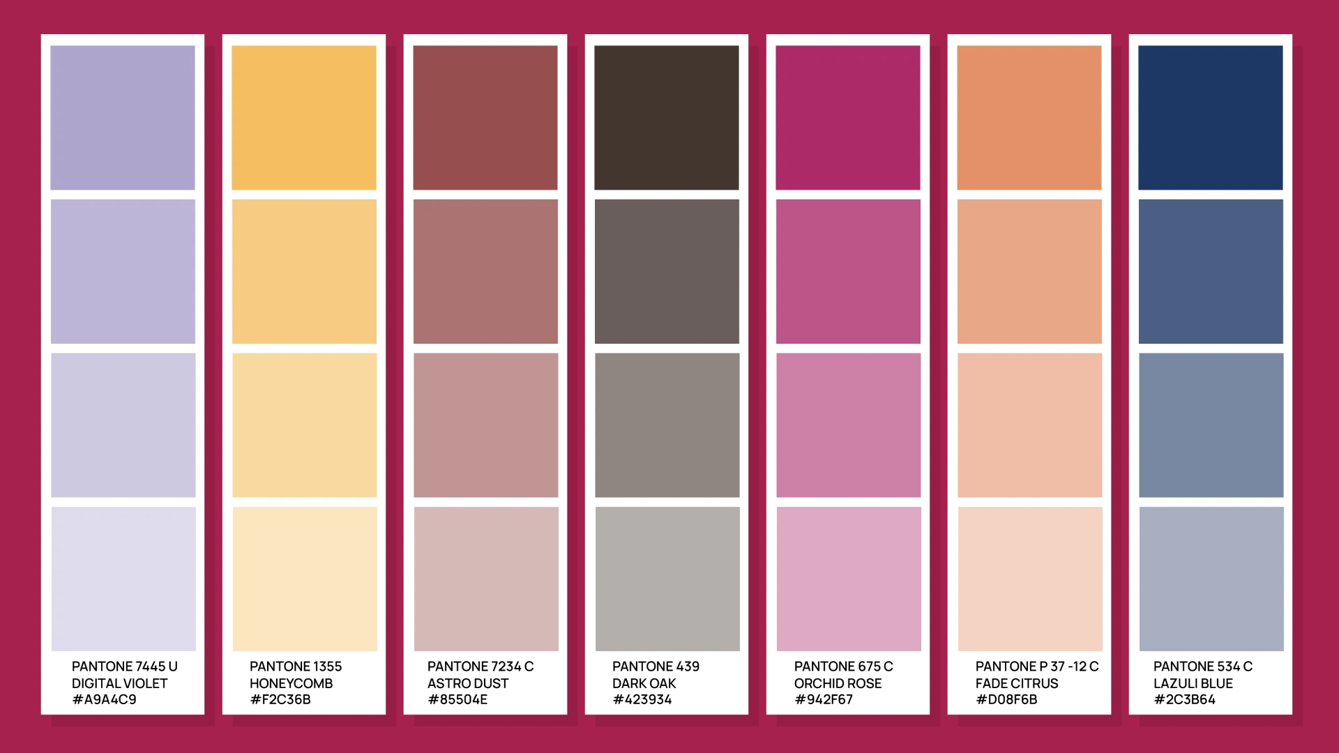
The third mistake is not documenting your colours properly. “The dark green we always use” is not a specification. Without exact HEX codes for digital use, RGB values for screen, and CMYK values for print, every designer and printer will interpret your brand differently. Over time, your green becomes five slightly different greens and your brand loses the consistency that builds recognition.
Before You Pick a Single Colour
Answer these four questions first. They will do more for your colour decision than any colour wheel or trend report.
What three words describe your brand’s personality? Your colours should feel like a visual translation of those words, not an afterthought once the logo is designed.
Who is your audience and what do they already respond to? A brand targeting young urban professionals in Nairobi is speaking to people with different visual references than one targeting rural agricultural communities. Context shapes perception.
What are your competitors doing? Map the colour landscape in your category, then decide whether to align with it or deliberately stand apart. Both are valid strategies, but one needs to be chosen intentionally.
Where will your brand appear? Some colours reproduce beautifully on screen but are expensive or difficult to match in print. If your business has both a digital presence and physical materials, packaging, signage, and stationery, your palette needs to work in both environments.
Final Thoughts
The right brand colours aren’t the ones that look nicest in isolation. They’re the ones that say the right things, to the right people, across every surface your brand touches.
Start with your brand personality. Let that point you toward your palette. Then build the system, primary, secondary, neutral, accent, document it precisely, and use it with discipline from day one.
Colour done right is one of the few branding investments that pays back every single day, across every single thing your business puts into the world.
Need help building a colour palette that works as hard as your business does? Let’s talk. Colour strategy is at the heart of every branding project we take on at Break Concepts.