
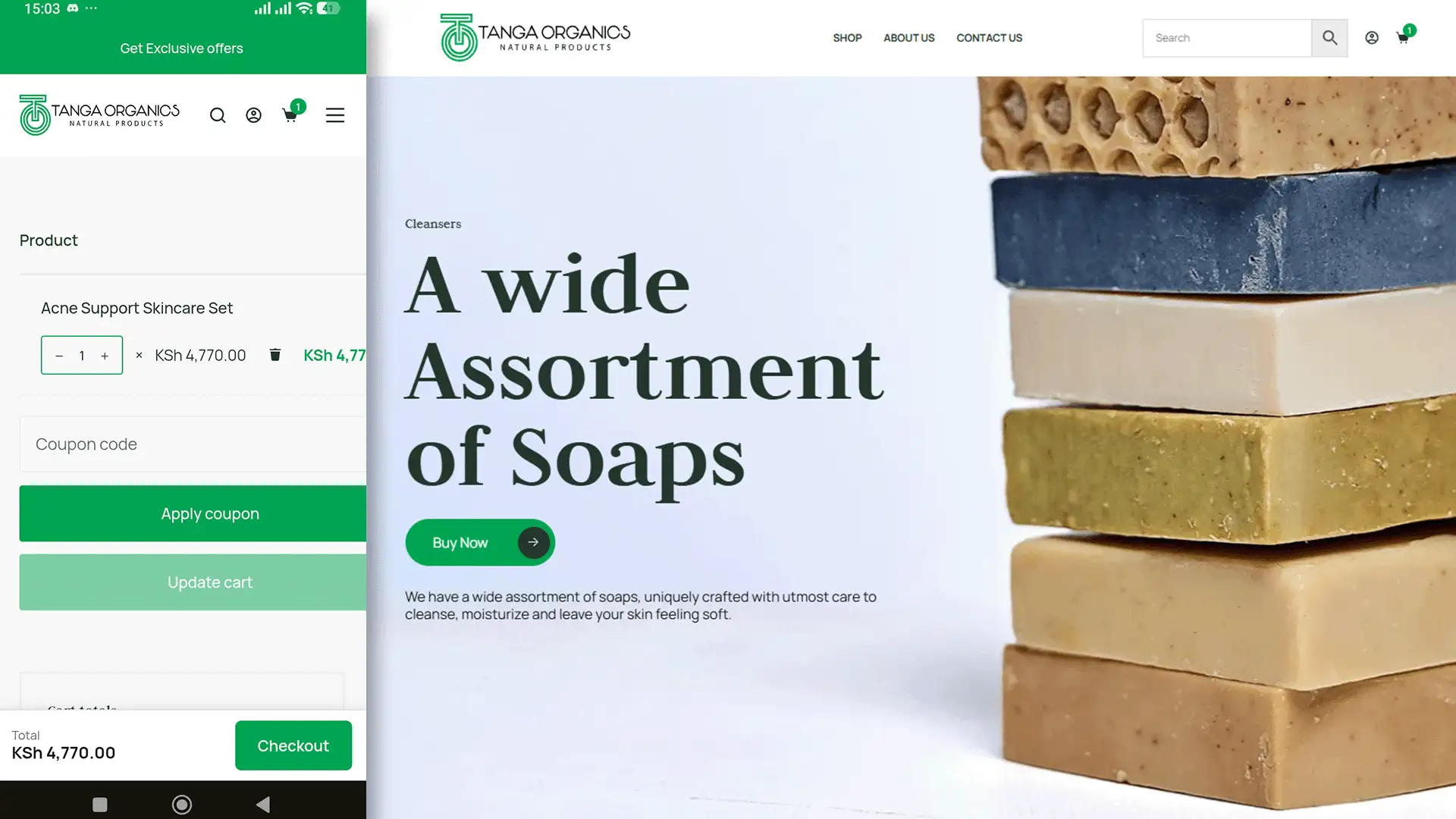

Envision the following: after having been looking forward to it for months, you have just launched the website. The homepage exactly matches the mockup, with the right colours, the logo placed perfectly in the header and clear photography. You give the link to a few friends and feel pleased.
If a customer tries to buy an item, the checkout process displays an error. Alternatively, when they get to the shipping stage, they see a wrong price. Or when they open the site on their phone, the whole site appears to be a reduced version of the desktop site and not one that has been designed for them.
Honestly, this is where so many business owners get tripped up: they look at a beautiful mockup and think, ‘Perfect, the website is done.’ But honestly, you can’t judge a website by a pretty picture. A screenshot only shows you the wrapper; it doesn’t tell you if a real human being can actually get through the checkout without pulling their hair out.
A Live Example, Not Another Principle
We manage the WooCommerce store for Tanga Organics, a Kenyan natural skincare brand built on plant-based formulas and small-batch production. Its founder, Joyce Rucha, didn’t need a portfolio piece. She needed a store that sells.
So for this edition, we’re not opening with a principle. We’re opening with what “working” actually looked like for Joyce’s site step by step, in the exact order it ended up mattering most.
The Checkout Has to Complete
This sounds obvious until it isn’t. At one point, checkout on the Tanga site started throwing a critical error at the final step, right after a customer had already decided to buy and entered their details. Here’s what caused it: a single hardcoded URL, buried inside the payment plugin’s own code, that the plugin’s own SDK then rejected. Not a design flaw. Not a content mistake. One wrong line, and the result was every completed sale silently failing at the finish line. A customer who has already committed to paying and then hits an error rarely comes back to try again. We patched the constant directly as a stopgap while the plugin developer works on a permanent fix upstream.
Drop your web team a line and ask: ‘What’s our move when this breaks?’ Notice I didn’t say if. Total reliability is a myth, so you need a plan for the inevitable.
The Checkout Also Has to Be Fast
A faster path to “buy” means fewer people talk themselves out of buying. That’s the whole logic behind this next fix. Most of Tanga’s shoppers are on mobile, and on a long product page, the “buy” button can end up several scrolls away from wherever the customer actually is. So we added a sticky checkout button on mobile: it stays in view as someone browses their cart, instead of making them hunt for it at the bottom of the page. Small change. One less reason for a mobile shopper to give up halfway through.
Shipping Has to Be Honest
Put yourself in the customer’s position for a second. You’re about to buy, and the shipping cost on screen doesn’t look right for where you live. Do you trust the rest of the checkout? Kenya doesn’t have a single flat courier rate that works everywhere, and pretending otherwise punishes half your customers. We mapped Tanga’s WooCommerce shipping zones to Fargo Courier’s actual tariff structure, so a customer in Nyeri and a customer in Nairobi each see a real, correct cost before they check out, rather than a flat fee that overcharges one and undercharges the other. Nobody compliments a shipping calculator. But it’s the kind of detail that quietly decides whether someone trusts the site enough to finish the order.
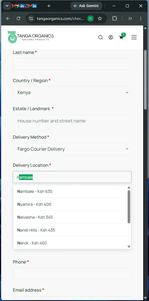
Mobile Has to Feel Considered, Not Squeezed
Most of Tanga’s traffic arrives on a phone. That single fact changes what “designed well” even means for this site: mobile isn’t a secondary consideration here; it’s the primary one. The shop uses pill-style category navigation and a horizontally scrollable nav bar, built specifically for smaller screens and deployed without touching the desktop layout at all. Compare the two approaches side by side and the difference is obvious. A site that’s simply compressed to fit a phone screen still makes the user work around it. A site designed for mobile from the start doesn’t ask anything of them.
Trust Has to Be Visible, Not Implied
Scroll to the bottom of tangaorganics.com. You’ll find real customer reviews. Full names attached. People describing exactly what changed for their skin, in their own words, not a generic “100% natural” badge doing the trust-building on the brand’s behalf.
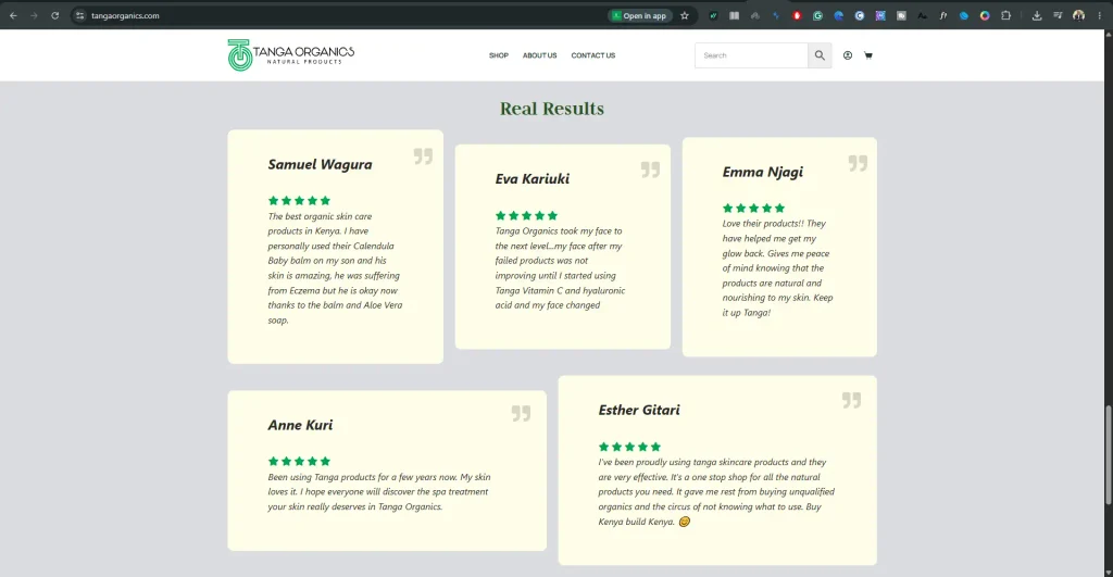
You cannot build online trust by claiming you are credible. Real trust happens when you step back. You hand your credibility over to real people. You let your customers, users, or community speak for you. They will make the case much better than you ever can.
Think about the last time a banner convinced you to buy something, versus the last time a specific review from a named person did. Customer claims do work that branding claims can’t, and they cost nothing to add once you have them.
When This Level of Attention Actually Matters
It’s easy to assume this level of detail is only for large e-commerce operations with big budgets. It isn’t. If you run a small or growing brand, this is exactly where you can least afford to lose a sale to a broken checkout or a shipping cost that doesn’t add up; you don’t have the volume to absorb it quietly the way a bigger company can. If you’re an NGO collecting donations, an SME selling products, or any small brand asking someone to complete a transaction online, these details aren’t optional extras layered on top of a website. They are the website.
Final Thoughts
Over the past several editions, we’ve talked about why your logo isn’t your brand, how to choose the right colours, and why every business eventually needs brand guidelines. Tanga Organics is where all of that stops being theory and starts being infrastructure the part nobody photographs, but the part a “successful” website actually depends on. A site can be visually flawless and still fail here. It can also be visually modest and still sell, because it works.
So here’s the question worth sitting with: if someone hands you a homepage mockup and calls the job finished, what would you actually ask them? Start with checkout. Ask about shipping logic. Ask what happens on a phone with a weak connection outside Nairobi. That’s where a brand is actually experienced, not on the mockup.
See it live: tangaorganics.com.
At Break Concepts, a website isn’t done when it looks right; it’s done when it works under real conditions. If your site is beautiful but you’re not sure it’s actually selling, let’s talk; it’s exactly the kind of problem we fix.


